 seolounge
A well-designed Contact Page allows potential clients, partners, or users to contact your firm. It’s not just a static component of your website; it’s a powerful tool for generating leads and building long-term partnerships. This guide will provide concrete tips, best practices, and real-world examples to develop an interesting and effective Contact Page.
Why is the Contact page so important?
Your Contact Page is one of the most popular pages on your website. Whether users have questions, require assistance, or are ready to make a purchase, this is where they will go. A poorly designed Contact Page might frustrate visitors, resulting in missed chances, but a simple and engaging one can build trust and inspire questions.
Key Benefits of an Effective Contact Page:
- Improves Accessibility: It ensures that users can readily communicate with your company.
- Drives Conversions: Encourages visitors to take the next step, such as initiating an inquiry or booking a meeting.
- Boosts Credibility: Shows that your company is personable and customer-oriented.
- Improves User Experience: A clean, responsive design leaves a lasting impression.
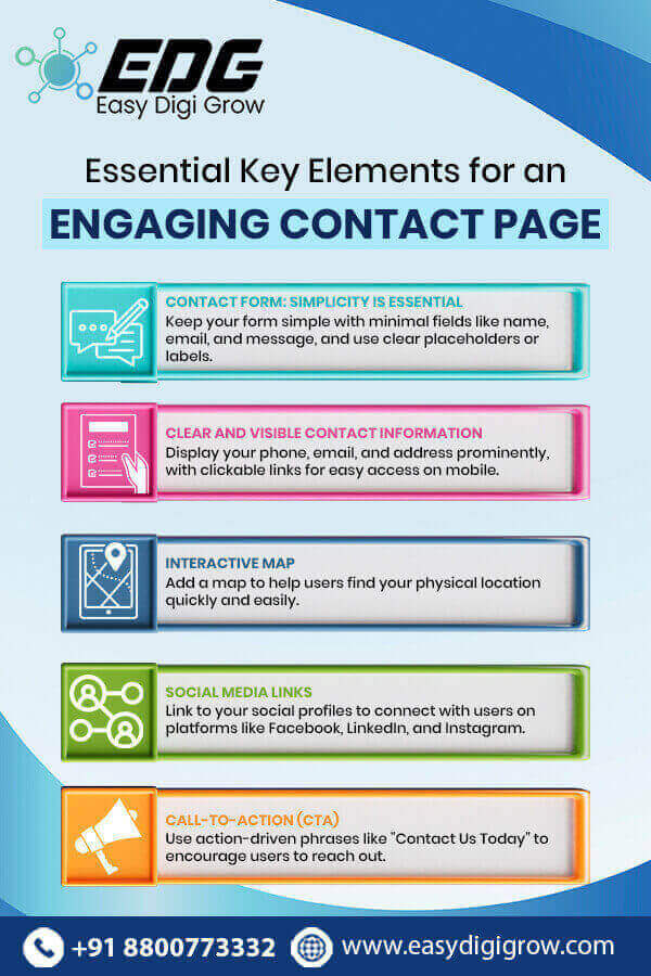
Essential Elements for an Engaging Contact Page
1. Contact Form: Simplicity is Essential
The Contact Form is the main feature of your Contact Page. It should be simple but effective to gather useful data.
Tips for Creating an Ideal Contact Form:
- Keep the number of fields to a minimum. Only request information that you truly require (for example, name, email, and message).
- Use placeholders or labels to direct users through the form.
- Use CAPTCHA or other similar methods to protect against spam.
- Create a confirmation message or email to inform users that their request was received.
2. Clear and Visible Contact Information
Not every user prefers to complete forms. Some may contact you directly. Make sure you include:
- Phone number: For those who like to communicate in real-time.
- Email: For more official or comprehensive inquiries.
- A physical address is required for enterprises with a physical location.
Pro Tip: Provide clickable phone numbers and email addresses for mobile devices.
3. Use an interactive map to help users find you.
If your company has a physical location, using an Interactive Map on your Contact Page might be a game changer. Google Maps, for example, allows users to easily locate you and provide directions.
4. Social Media Links.
Social media networks are an excellent method to connect with your audience outside your website. Provide connections to your company’s social media profiles, such as:
These links also showcase your brand’s transparency and willingness to engage with users on multiple channels.
5. Call-to-Action (CTA)
An effective CTA motivates consumers to take the desired action. Phrases include:
“Let’s Connect!”
“We’d Love to Hear from You!”
“Contact Us Now for a Free Quote!”
Make your Contact Page inviting and action-oriented.
Design Tips to Make Your Contact Page Stand Out
a. Minimalist Design
In many cases, simplicity is the best policy. Avoid overwhelming users with excessive text or superfluous components. Use a simple, clear look to draw attention to what matters most: your Contact Form and details.
b. Consistent Branding
Ensure your Contact Page aligns with your brand’s visual and verbal tone. Use your brand colors, logo, and typography to create a cohesive look.
c. Mobile-First Approach
With more users accessing websites via mobile devices, your Contact Page must be fully responsive. Test it across various devices to ensure optimal usability.
d. Fast Loading Speed
A slow-loading page can drive users away. Optimize images, reduce unnecessary scripts, and ensure your Contact Page loads quickly.
Enhancing User Trust and Engagement
A successful Contact Page doesn’t just look good; it also builds trust. Here’s how you can make your page more engaging and credible:
1. Add a Personal Touch
Include a short, friendly introduction or message. For instance:
“We’re here to answer your questions and help you find the best solutions. Don’t hesitate to reach out!”
2. Showcase Testimonials or Reviews
Adding positive feedback from existing customers instills confidence in potential clients. A short testimonial section can work wonders.
3. Privacy Assurance
Many users are hesitant to share personal information online. Include a privacy statement reassuring them that their data is secure and will not be shared.
4. Team Photos or Videos
Humanize your brand by showcasing your team. A photo or short video introduction can make users feel more connected.
Common Mistakes to Avoid
- Hiding the Contact Page: Ensure the link to your Contact Page is easily visible in the navigation menu or footer.
- Complicated Forms: Long, cumbersome forms deter users. Keep it short and simple.
- Outdated Information: Regularly update your contact details to maintain accuracy.
- Ignoring Accessibility: Ensure your Contact Page is accessible to all users, including those with disabilities.
How to Measure the Success of Your Contact Page
Use analytics tools to monitor how users interact with your Contact Page. Key metrics to track include:
- Bounce Rate: Are users leaving the page without taking action?
- Form Submissions: How many inquiries are you receiving?
- Click-through Rate: Are users engaging with your CTAs?
These insights will help you identify areas for improvement and optimize your Contact Page for better performance.
Conclusion
Your Contact Page is a crucial touchpoint between your business and potential customers. By incorporating user-friendly design, clear information, and a personal touch, you can create a page that not only drives inquiries but also builds trust and fosters long-term relationships.
Don’t underestimate the power of your Contact Page—start optimizing it today and see the difference it makes!


