 seolounge
Website navigation is a crucial component of the user experience (UX). It acts as a link between users and the material they want, guiding them through your site. Poor navigation can frustrate users, increase bounce rates, and affect page performance. To provide a positive user experience and maximize conversions, it is essential to avoid navigation problems. Here’s a detailed look at the most common mistakes and how to fix them.
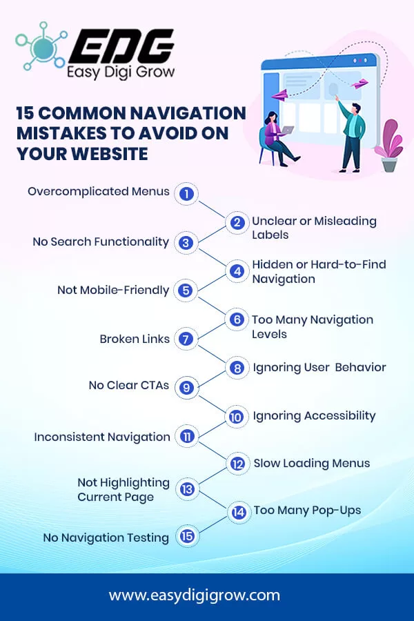
1. Overcomplicated Navigation Menus
A Website navigation menu that is extremely complex or has too many items can be confusing to users. When visitors are given too many options, they may struggle to find what they need, resulting in irritation and a greater bounce rate.
How To Avoid It:
- Make use of a simple, easy-to-follow menu layout.
- Limit the main menu to 5-7 items.
- Grouping related items in dropdowns or submenus improves clarity.
2. Unclear or Misleading Labels
Using unclear or uncommon language for navigation labels can lead to user confusion. For example, instead of calling a section “Products,” employing jargon like “Offerings” may lead visitors astray.
How To Avoid It:
- Use basic, descriptive language that everyone understands.
- User testing is performed to confirm that the labels correspond to user expectations.
- Avoid using internal jargon or too inventive names that will confuse users.
3. No Search Functionality
Not all users will rely solely on the navigation menu to find information. Without a search bar, visitors may leave your site if they can’t locate what they’re looking for quickly.
How To Avoid It:
- Include a prominently placed search bar on every page.
- Ensure the search feature is functional and provides relevant results.
- Use auto-suggestions to improve the search experience.
4. Hidden or Hard-to-Find Navigation
Some websites make navigation difficult by hiding menus or placing them in strange locations. This is especially hard for mobile users.
How to Avoid It:
- Use the standard top or side navigation bars.
- Ensured menus were viewable and reachable on all platforms.
- Do not only use hamburger menus for desktop users.
5. Lack of mobile-friendly navigation.
Mobile traffic now dominates the web, therefore if your website’s navigation system fails to function effectively on small screens, you risk losing a huge chunk of your target audience.
How To Avoid It:
- Use responsive design so that your website navigation works correctly on all devices.
- Use mobile-friendly menus such as collapsible or dropdown options.
- Test your website navigation on different screen sizes and devices to make sure it works smoothly everywhere.
6. Too Many Levels of Navigation
Too many submenus and navigation layers can make it difficult for users to locate information. If users must go through too many steps to reach their target, they may abandon their search and leave the website.
How to avoid it:
- Keep the Website navigation depth at 2-3 levels.
- Use breadcrumb navigation to assist users navigate.
- Organize your materials logically to remove unnecessary layers.
7. Broken Links
Broken links disrupt the user journey and create a negative impression. They also harm your site’s SEO performance.
How to Avoid It:
- Regularly audit your website for broken links.
- Use tools like Google Search Console or Broken Link Checker.
- Redirect outdated pages to relevant alternatives using 301 redirects.
8. Ignoring User Behavior Analytics
Failing to analyze how users interact with your website navigation can lead to missed opportunities for improvement. Without data, you may be unaware of bottlenecks or underperforming sections.
How to Avoid It:
- Track navigation behavior with technologies such as Google Analytics, Hotjar, and Crazy Egg.
- Keep track of click-through rates and page load times.
- Adjust your Website navigation in response to user feedback.
9. No Clear Call-to-Actions (CTAs)
Navigation menus that lack CTAs or place them in obscure locations can fail to guide users toward desired actions, such as signing up or making a purchase.
How to Avoid It:
- Include CTAs like “Contact Us,” “Shop Now,” or “Learn More” in prominent locations.
- Use contrasting colors and buttons to make CTAs stand out.
- Check that the CTAs on each page correspond to the user’s goal.
10. Ignoring Accessibility Standards
Navigation that doesn’t cater to users with disabilities limits your site’s reach and may violate accessibility laws.
How to Avoid It:
- Adhere to guidelines for creating accessible web content.
- Ensure that descriptive link language is provided for screen readers.
- Verify keyboard navigation and tabbing functionality.
11. Lack of Consistency Across Pages
Inconsistent Website navigation between pages will confuse the user and your site may appear disjointed.
How to Avoid It:
- Use the same menu layout across all pages.
- Brand and style must be uniform.
- Navigation elements should be in similar places.
12. Slow Loading Navigation
If your navigation menu takes too long to load owing to heavy scripts or design elements, users may lose patience and leave.
How to avoid it:
- Compress images and reduce script count on the page to increase the loading speed.
- Use lightweight plugins as well as themes to optimize for performance.
- Testing of your site load times regularly to maintain access speed.
13. Failing to Highlight the Current Page
When users fail to recognize which page they’re currently on, it complicates Website navigation.
How to avoid it:
- Use visual clues in terms of bolded text, underlined, or some change in color for your current page.
- Make sure that the breadcrumb trail correctly reflects the user’s position.
14. Too Many Pop-Ups
Navigational pop-ups annoy and disrupt user journeys. This is particularly damaging for mobile devices.
How To Avoid It:
- Restrict pop-ups and ensure they don’t obstruct essential navigation elements.
- Use exit-intent pop-ups to avoid annoying engaged users.
15. Lack of Navigation Testing
Websites change, and Website navigation needs to be tested periodically to ensure it is not broken.
How to Avoid It:
- Test your website with actual users.
- Obtain feedback from surveys or heatmaps.
- Update navigation based on user feedback and changing trends.
Conclusion
Good website navigation is about clarity, simplicity, and accessibility. By avoiding these common mistakes, you can create a user-friendly experience that keeps visitors engaged and guides them to their desired destinations. Regular audits, user testing, and adherence to best practices will ensure your site’s navigation stays optimized and effective. A seamless navigation system doesn’t just improve user satisfaction—it boosts conversions, enhances SEO performance, and builds trust in your brand. Make navigation a priority and watch your website thrive!


