Responsive Web Design

Your Reliable Responsive Web Design Company In Noida, India

At EasyDigiGrow, we take pride in being a top responsive web design company that caters to businesses of all sizes and industries. Our dedicated team of skilled designers and website developers understands the ever-changing landscape of responsive web design services in Noida and stays up-to-date with the latest trends and technologies.

Whether you are a startup, small business, or large enterprise, we offer customized responsive web solutions that are not only visually captivating but also function flawlessly, helping you stand out from the competition.

As an agency committed to delivering top-notch responsive web design services, we believe that cost should never be a barrier to accessing high-quality solutions. That’s why at EasyDigiGrow, we offer affordable responsive web design packages that meet your specific requirements without compromising on quality. We understand the importance of staying within budget while still having a website that reflects your brand’s essence and drives business growth.

Located in Gurgaon, Delhi NCR, we are strategically positioned to serve clients not only in the local region but also across the globe. At EasyDigiGrow, we believe that every business deserves a stunning and functional website, and we are here to turn your vision into reality, providing you with the perfect platform to connect with your target audience and boost your online success.

Importance of Responsive Web Design Services

Mobile Usage – Having a responsive website ensures that your content is easily accessible and visually appealing on smaller screens. Thus, allowing you to reach and engage a larger mobile audience.

User Experience – Responsive web design ensures that your website automatically adjusts its layout, images, and navigation to fit the screen it is being viewed on. This creates a consistent and intuitive user experience, regardless of the device, resulting in higher user satisfaction and increased engagement.

SEO Benefits – A responsive website not only improves user experience but also positively impacts your search engine rankings. By having a single, responsive website, you consolidate your SEO efforts and increase your chances of ranking higher.

Cost and Time Efficiency – You don’t need to create and maintain separate versions of your website for different devices. This saves time and resources that would otherwise be spent on developing and updating multiple sites.

Improved Conversion Rates – A user-friendly and visually appealing website leads to higher conversion rates. By providing a seamless browsing experience across devices, it eliminates barriers to conversions.

India's leading responsive web design services

RESPONSIVE FLUID LAYOUT

Our team utilizes fluid grid systems that enable the layout to adapt and scale proportionally, ensuring that your website looks visually appealing and functions seamlessly on any device.

Content Creation and Marketing Services

CONTENT PRIORITIZATION

We understand the importance of displaying the most essential content prominently. With responsive design, we strategically prioritize and rearrange content to ensure that it remains accessible and engaging, regardless of the device being used.

Content Creation and Marketing Services

MEDIA QUERIES

Our developers incorporate media queries, which allow us to apply specific styles and adjustments based on the characteristics of the user's device. This ensures that your website adapts seamlessly to different screen sizes, resolutions, and orientations.

Affiliate Marketing Services

OPTIMIZED IMAGES & MEDIA

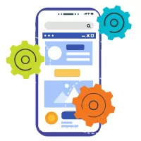
We optimize images, videos, and other media elements to ensure fast loading times and optimal performance on all devices. By automatically scaling and resizing media, we deliver a visually appealing experience without sacrificing performance.

TOUCH-FRIENDLY INTERACTIONS

As touchscreens become increasingly prevalent, we design with touch-friendly interactions in mind. We incorporate larger buttons, spacing between links, and swipeable elements to enhance usability and navigation on touch-enabled devices.

Why choose us as your responsive web design company?

Content Creation and Marketing Services

Expertise and Experience – We have in-depth knowledge and expertise in creating websites that seamlessly adapt to different devices and screen sizes. With our skills and industry experience, we can deliver a responsive website that meets your specific requirements.

Customized Approach – EasyDigiGrow takes a customized approach to responsive web design. We take the time to understand your business, target audience, and goals, ensuring that the design aligns with your brand identity and caters to your audience’s needs. We tailor the responsive design to provide an optimal user experience and achieve your desired outcomes.

Mobile-first Approach – EasyDigiGrow, a trusted responsive web design company, follows a mobile-first approach. We understand the increasing importance of mobile devices and prioritize the mobile user experience. With our expertise, we create websites that are not only visually appealing but also responsive and user-friendly across all devices.

Focus on User Experience – We design intuitive and user-friendly interfaces, ensuring that visitors can easily navigate and interact with your website across different devices. By prioritizing user experience, EasyDigiGrow helps you engage and retain users, leading to higher conversions and customer satisfaction.

Cutting-edge Technologies – Our company leverages modern tools and frameworks to create responsive websites that are visually appealing, fast-loading, and compatible with various browsers and devices. By utilizing cutting-edge technologies, EasyDigiGrow ensures that your website is future-proof and can adapt to evolving technological advancements.

Future-Proofing – With responsive design, your website will remain compatible with future devices, eliminating the need for frequent redesigns or separate mobile updates. Our future-proofing approach ensures that your website stays relevant and accessible to users on emerging devices.

Budget-Friendly Responsive Web Design Packages to
Boost Your Business Growth!

As a leading affordable responsive web design company in Delhi/NCR, EasyDigiGrow is dedicated to empowering your online presence in today’s mobile-driven world. With our expertise in responsive web design, we guarantee that your website will provide optimal viewing and seamless usability across all devices, ensuring an exceptional user experience for your audience.

We understand the importance of affordability without compromising on quality, and our tailored solutions ensure that you receive top-notch services at competitive prices.

Choose EasyDigiGrow as your responsive web design partner, and let us unlock the full potential of your online presence. With our comprehensive services, you can confidently connect with your target audience on any device, establish your brand’s credibility, and stay ahead of the competition.

Experience the power of responsive web design with EasyDigiGrow and take your digital success to new heights. Contact us today and embark on a journey of enhanced user experiences and business growth.

Frequently asked questions

EasyDigiGrow follows a streamlined development process to ensure the efficient and timely delivery of responsive websites. Upon understanding your unique needs, we can provide you with a timeline and keep you updated throughout the development process.

Yes, EasyDigiGrow ensures that your responsive website is compatible with a wide range of devices, including smartphones, tablets, and desktops. We utilize industry best practices and test the website across different browsers and devices to ensure consistent performance and functionality.

Absolutely! We provide user-friendly content management systems (CMS) that empower you to update and manage your website content with ease. With our guidance and training, you’ll have full control over your responsive website’s content, ensuring it stays up-to-date and relevant to your audience.

A mobile-friendly web design ensures that your website displays correctly on mobile devices. This often involves maintaining separate websites for mobile and desktop users, which can be costly and time-consuming. On the other hand, responsive web design offers a universal solution that adapts seamlessly to any device or screen size. With our responsive web design services, you only need to manage one website, making it a cost-effective and efficient approach.
 
Here are a few noteworthy trends: Dark Mode, micro-interactions (subtle animations or visual cues), Voice User Interface, Performance Optimization, Minimalistic Design, Accessibility, etc. By incorporating these current trends into your responsive web design services, you can stay at the forefront of user satisfaction.
 

CONTACT US

Let's talk to discover possiblities...